

Two dairy brands sell skyr in similar dark blue packaging featuring a snow-covered mountain landscape. Does this mean that one is infringing on the other’s trademark? On January 8, 2026, the presiding judge of the French-speaking Commercial Court in Brussels ruled in the case of Yoplait v. Danone that it does not: as long as the highly distinctive word marks “Yoplait” and “Danone” are prominently displayed on the containers, there is no risk of confusion, even though the packaging shares color, imagery, and product category. Danone’s advertising slogan “No. 1 Taste,” however, was banned because the taste test on which it was based could not be verified by Belgian consumers.
The facts
Yoplait and Danone are competing dairy producers that both sell skyr, a high-protein dairy specialty of Icelandic origin. Yoplait introduced its skyr to the Belgian market in May 2024 in dark blue packaging featuring a snow-capped mountain, a spoonful of the product, and the “Yoplait” word mark with a stylized yellow-and-red flower.
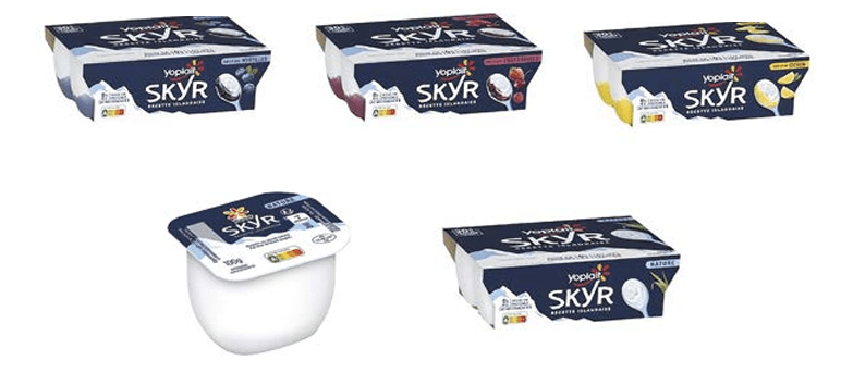
In January and February 2025, Yoplait registered four Benelux trademarks, including one that consisted solely of a figurative mark without any word element (dark blue background, snow-capped mountain on the left, slanted spoon on the right).

In November 2024, Danone launched its new skyr packaging, also in dark blue, featuring a mountain landscape and a Viking with a shield.

Yoplait served Danone with a notice of default and subsequently sued it in the injunctive relief court for trademark infringement, unfair trade practices, and unlawful comparative advertising. In a counterclaim, Danone sought the invalidation of the pure figurative mark on the grounds of lack of distinctiveness.
The decision
The presiding judge first dismissed the counterclaim for annulment. A combination of elements that are not distinctive in and of themselves (dark blue, snow-capped mountain, spoon) may nevertheless be perceived as an indication of origin when their arrangement, considered as a whole, confers distinctiveness on the mark. Danone provided examples showing that each element individually appears commonly on dairy packaging, but none of them combined the three elements in the same arrangement as Yoplait. Nor did Danone prove that the average consumer could not perceive the mark as a trademark. The figurative mark was therefore declared valid.
The chair then assessed the likelihood of confusion pursuant to Article 2.20, paragraph 2, subparagraph b BTIP, by comparing each of the four cited trademarks separately with the Danone packaging. Although the goods are identical and are sold in the same manner in supermarkets, the presiding judge ruled that there was no likelihood of confusion among the general public with an average level of attention. After all, the visual similarities concerned only non-distinctive or weakly distinctive elements (the word “skyr,” the colors dark blue and white). There was no phonetic similarity, and the conceptual similarity was minimal. The highly distinctive word marks “Yoplait” and “Danone,” prominently displayed on the packaging, were sufficient to rule out any likelihood of confusion. A market survey submitted by Yoplait was not convincing: it compared products rather than brands, and 61 percent of respondents did not quite confuse the packaging.
For the same reasons, the presiding judge dismissed the claim regarding misleading commercial practices. The similarity in the dark blue color alone was not sufficient to alter the consumer’s economic behavior. Differences in the word mark, packaging type, flavors, and price sufficiently distinguished the products.
The claim regarding comparative advertising was, however, partially upheld. The statements “No. 1 Taste” and “#1: Belgium’s best skyr” constitute comparative advertising within the meaning of Art. VI.17, 3° Code of Economic Law. While taste is subjective, it can serve as a valid criterion for comparison if it is objectified through reliable methods. The initial taste test was conducted primarily in the Netherlands, with only ten Belgian respondents, and was therefore not objective. A later test involving 240 Belgian consumers was sufficiently representative. Nevertheless, the chairperson banned the advertisement because the packaging and promotional materials still referred to the first, insufficiently objective test, whereas the comparison must be verifiable by the consumer. Danone Belux was given 45 days to amend the reference, under penalty of a daily fine of 1,000 euros, up to a maximum of 50,000 euros.
Legal analysis and interpretation
Weak visual elements are offset by a strong word mark
The ruling is a textbook example of the two-stage model for assessing the likelihood of confusion. In the first stage, the signs are compared visually, phonetically, and conceptually, based on their intrinsic qualities. In the second phase, an overall assessment is conducted, taking into account, among other things, the distinctiveness of the elements. The core of the reasoning is that similarity in non-distinctive or descriptive elements does not give rise to a likelihood of confusion: the similarity lies in the word “skyr” (which is descriptive of the product) and in colors that are widely used in the dairy sector.
This is fully in line with the established case law of the Court of Justice, which, for the purpose of assessing similarity, relies on the Canon-ruling, which requires an overall assessment of the likelihood of confusion based on all relevant factors. The average consumer perceives a trademark as a whole; in the case of a combined word/figurative mark, the word element generally dominates, because the public refers to a trademark by its name. By giving weight to the prominent, mutually distinct word marks, the presiding judge applies that principle. It is noteworthy that the identity of the goods and the identical sales conditions in department stores were not sufficient to tip the balance regarding the likelihood of confusion: the interplay between the factors only comes into play when there is also actual similarity in the distinctive elements.
The situation is different for a purely figurative trademark, without a word element. In such cases, the trademark owner cannot hide behind a strong word mark, so the figurative elements themselves must make the difference. The chairperson concluded that the similarity was very weak, in part because the shade of blue and the depicted landscape (a mountain versus an ice field with a Viking) differed. This illustrates the downside of a trademark consisting solely of weak distinctive elements: it is valid, but the scope of protection is limited.
The Limits of Market Research as Evidence
The way in which the chairperson weighs the studies presented deserves attention. In the trademark infringement case, she rejected the market research because it compared products rather than trademarks and signs, and because the research design could have influenced the respondents. In the comparative advertising case, however, she accepted the survey of 240 Belgian consumers as sufficiently representative, citing an international ISO standard.
This distinction is methodologically sound: a confusion study must reflect the legal question of origin confusion, not merely the question of whether packaging designs resemble one another. At the same time, the ruling shows that the objectivity of a taste claim stands or falls with the representativeness of the sample for the relevant—in this case, Belgian—public. A test conducted predominantly in another country cannot substantiate a claim regarding the Belgian market, regardless of geographical proximity or similar consumption habits.
Perhaps the most striking finding is that even a test that is correct in and of itself does not save the advertisement, as long as the promotional material continues to refer to the flawed test. The verifiability requirement means that the consumer must be able to verify the basis for the superlative claim; a correct justification that cannot be found, or a justifiable claim that is flawed, is insufficient. The fact that the presiding judge rejected the request to recall the products as disproportionate—given the short shelf life of dairy products—and deemed an amended reference sufficient, is consistent with the principle of proportionality that the injunction judge must take into account.
Specifically, what does this mean?
For brand owners in the food industry. Anyone who wants to protect their market position against similar packaging used by competitors would be wise not to rely solely on color and imagery. Colors and generic designs that are widely used in the industry offer weak distinctiveness and, therefore, limited scope of protection. A strong and visible word mark provides the strongest protection. Those who still wish to use a purely figurative mark should bear in mind that protection is limited to marks that closely resemble it.
For anyone designing new packaging. A availability search covering the entire product category remains advisable, but this ruling confirms that adopting a color and generic visual motifs commonly used in the industry does not in itself constitute trademark infringement as long as the company’s own word mark is clearly present. However, internal communications in which a color or style is deliberately adopted can be used against you; be sure to document design choices carefully.
For those who use superlatives in their advertising. A claim such as “No. 1 in taste” constitutes comparative advertising and must be objective and verifiable. Support the claim with a test conducted on a representative sample of the audience to which the claim applies, and ensure that the promotional materials and packaging refer to that valid test. An outdated or incomplete reference renders the advertisement unlawful, even if a valid study has since been conducted.
Frequently asked questions (FAQ)
Can a competitor use the same color for its packaging?
A color that is commonly used in an industry has little distinctive character in and of itself. Simply adopting such a color—even an identical shade—does not constitute trademark infringement as long as the other elements, and in particular the word mark, sufficiently distinguish the products.
When is a claim such as “No. 1 in taste” permitted?
Taste is subjective, but it can serve as a criterion for comparison if the claim is objectified using a reliable method, such as a representative consumer test. Furthermore, the claim must be verifiable: consumers must be able to verify the basis for the superlative, either through the advertisement itself or a source that can be easily found.
Does market research count as evidence of a likelihood of confusion?
A study may be useful, but it is subject to critical scrutiny. A study that compares products rather than brands, or that leads respondents, does not provide convincing evidence of a likelihood of confusion as to origin. The burden of proof regarding the likelihood of confusion rests with the plaintiff.
Conclusion
The case reaffirms two principles that are important for every player in the food industry. Packaging in a color that is common in the sector and shares generic visual motifs with those of a competitor does not constitute trademark infringement as long as highly distinctive word marks clearly indicate the source; the protection of weak visual elements is limited. At the same time, a superlative taste claim stands or falls on the basis of a representative test conducted among the appropriate audience and on its verifiability within the advertisement itself.


